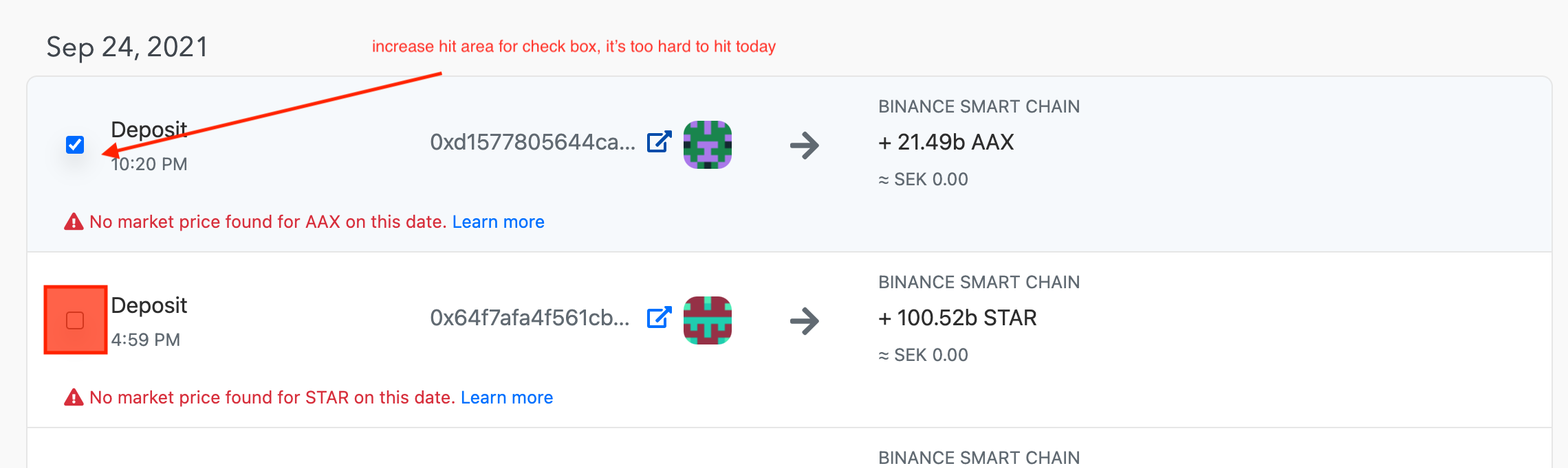
I purpose to enlarge the hit area for the checkboxes in transactions view. I find myself constantly having issues hitting them when I want to toggle a bunch of transactions in succession.
This is on our list, thanks for the suggestion!

I purpose to enlarge the hit area for the checkboxes in transactions view. I find myself constantly having issues hitting them when I want to toggle a bunch of transactions in succession.
This is on our list, thanks for the suggestion!