Long List of Koinly UI Changes

Here is a long list of changes that would good a long way to making manually using Koinly not a complete and total slog.

  1. Make the checkboxes bigger, they’re way too small, especially on big screens

  2. Let us select multiple currencies, wallets, and labels to view at the same time instead of just all/none

  3. Move the green “Transaction Updated” notification box that appears after editing a transaction at the bottom of the screen somewhere else so it doesn’t block the box for merging/deleting/tagging multiple transactions.

  4. Let us shift-click to select multiple transactions in a series instead of needing to click on each one individually

  5. Let us change the number of transactions viewable on a single page.

  6. Be clearer with naming bridged tokens on sidechains. Koinly will call both “USDC” and “USDC Coin From BSC” just “USDC” and doesn’t treat them as identical in the ledger. This makes it very difficult to get things right with token bridges.

  7. Let us choose a time zone

  8. When editing a Withdrawal, if you accidentally select “transfer” you cannot switch to a different type of transaction.

  9. Let us tag addresses with particular names so we can track them across transactions

  10. Have a tag for loans

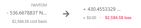
  11. Truncate the number of decimals displayed if there are so many that it would obscure the ticker. This is especially important for coins with no symbol. See below for how silly this is. I can’t figure out what the below tokens are unless I click on the transaction itself.
    image

  12. On the Ledger Changes page, every Tx# should hotlink to the transaction in question, because as far as I can tell, there is no way to easily search for a particular transaction ID.

  13. When creating/editing a transaction, make it possible to select the “Trade” or “Swap” options and then pick a different category instead of having to close out the editor entirely.

  14. When selecting dates/times, the calendar date should default to the date/time of the transactions you are currently viewing.

  15. When selecting a coin type, USD (fiat) should not appear as the first choice every time, even when the coin being searched for contains none of the letters U, S, or D.

  16. Let us view more than 10 wallets on a page.

@Originality

AMEN!

Thank you so much for taking the time to create this list. I have also asked for many of these things before. The Devs seem to be rather shy about mentioning progress (or lack thereof).

It would be so good to hear from them wether any of these thing is being worked on as they are crucial to having a functioning software. As of now there is no way the IRS would approve of the tax reports due to so many issues - and yes, the usability and functionality issues you point out are strongly hindering one from even trying to get it right, I have accrued something like 4000 trades in the last two months, spread over 9 exchanges and 4 wallets. It’s impossible to do this with Koinly as of now. The merging of transactions (i.e. Kucoins refunded fees that need to be merged with the actual fee but in Koinly gets categorized as INCOME!!!) aaaaaahhh. I don’t even know where to begin.

KOINLY TEAM are you listening? :wink:

5,10,14 would be nice additions, the rest just seem a bit petty.

Most of these are very basic UI features that I’ve seen on similar tax websites. #4 is a basic UI feature of modern digital lists! Maybe these seem like small changes to you, but if you’re having to manually edit hundreds of transactions because of how poorly Koinly imports transaction info, you would realize that these things would save you hours of time.

1 Like

yes yes and yes!
I’ts mindblowing to me how long it takes for a token to show up in the list, plus the cumbersome selection of it afterwards. It’s a process that probably takes 3-4 seconds (and feels like an eternity) for something that should take half a second

Hi Originality,

Thank you for creating this list - it will be helpful for our devs.

Most of these are currently being worked on or on our backlog.

We are working on a pretty big update to the Transactions page which will change the searching, filtering, and tagging system and also allow much more transactions to be displayed on each page.
I can’t provide an ETA at this time but that update will tick a few of your boxes :slight_smile:

Best regards,
Petur

2 Likes

Concerning #11: Probably it’s truncated with the space on a smartphone in mind. I have lots of space on my computer screen and still it’s tuncated and I can’t see the coin ticker.
But I fully agree: If there is need for truncation, do it at the decimals, not at the ticker.